Saturday, 30 March 2013

Mixed Media Collage

These are my mixed media collages:

Here I ripped up two different pictures and mixed some of the pieces to gether to make this background. before I stuck these down I covered the paper with black chalk once I stuck them down I then added the red chalk lines in between.

The two images below were inspired by Mario Corea:


For this one I ripped out to images of different people stuck them onto the page and then painted around them with blue acrylic paint.


Here I used black chalk and blue acrylic paint to split the image into two sides.

Finally for this idea I decided to use a similar idea I used for the previous collage experiments. By cutting a picture into squares and then painting in the gaps to add colour and depth.

I really like these collage ideas and I want to develop them further to use within my final outcome. To improve these I could make the materials, colours and techniques relate to the person in the image to reveal a bit of there identity to get the viewer thinking.

Friday, 29 March 2013

Collage

These are my first collage experiments:


Here I cut out a square of paper which I stuck over the subjects head to hide his identity and then drew a question mark in red pen on it.

Next I cut up a picture into stripes and rearranged them to muddle up and obscure the image so you cannot see his identity.


Finally I cut up two different pictures of different people, into different sized squares and then mixed them together to create this effect.

Overall I feel these images are lacking the wow factor and could be improved by adding in colour and different materials as they are currently very dull and boring.

Wednesday, 27 March 2013

Mario Corea Analysis


This collage is by Mario Corea a fine artist and architect from Barcelona, Spain. He was born in 1939 in Rosario where he grew up and studied architecture. In 1964 he moved to Boston where he got a Master of Architecture in Urban Design degree. He is currently both his professional practice in architecture and his academic career by doing lectures and workshops across the world. The name of this piece is 'The Ballad of Love' one of the 35th Street series made in 2003. I have chosen to analyse this piece as I find it really inspiring and want to create something similar as it seems to have a obscure effect which fits in well with my theme. 

I have looked at his architecture website and his Behance portfolio to find out more about him and this work. I believe the theme of this piece of artwork is urban lifestyle as the background shows images of buildings and the rest of his work seems to portray the same theme. The composition of the work also makes it look like a face from a far because of the eye and paint, which could be suggesting a hidden identity of the location.

He uses different images to make up a collage on a piece of cardboard which he then paints over/around with acrylic paint to build up a powerful effect with subtle detail within it. He uses typography within the collage aswell to give the viewer a hint of what the images is about, for example the title of the image above is incorporated within the work. He has used black paint around the edges of the artwork possibly to suggest there is a darkside to the subject or to give a border to it so the centre stands out more. This draws all the viewers attention to the eye and typography which are surrounded by black. The world love is in red so that it stands out well as it is the only splash of colour within the artwork and because red is normally associated with love.

When I first saw this piece the thing that stood out to me most was the eye as it is the centre of the page and looks like its looking out at you which draws you in. I think the overall composition of the piece is very bold and I love that when you look at it more closely you see the more subtle detail within the background, such as the buildings. The only thing I would say I dislike is that you cant see much of the images in the background and I think it would be nice if you could see a bit more. However I find this work really inspiring and would like to create some collages with similar techniques to fit my covert and obscure theme.

Here is my attempt at creating a similar effect:


Here is another example of his work:


Sunday, 24 March 2013

Further Film Experiments

The piece of photographic paper was moved slightly whilst it was being exposed to get this effect:


I like this experiment and would possibly like to develop it in the future, by trying it with different photographs.

Sandwiched negatives:


This is my favourite technique so far and I would like to develop it further. I feel it relates to the exam theme, covert and obscure, really well as sandwiching the negatives obscures some parts of each image and brings out others.

Reversal:


To improve this image i would add glass on top of the paper when exposing it to light as some of it is a bit blurry. Also I would like to try it using the original photographs so the whole image is reversed, unlike this image where I used the dodging and burning image below.

Painted on developer:


I think this technique is effective as it helps to give more of a meaning to the image.

Dodging and buring:


This is one of my favourite photographs so far but I think it is a bit to plain a simple and I want to create something more exciting.

Saturday, 16 March 2013

Review

For the first photoshoot my 4 ideas were objects in obscure places, spying on people, my cats point of view and hidden identity. My favourite idea that I want to develop was the hidden identity theme as it seemed to work the best and I feel it has the most potential.


From all the experiments I have done so far, my favourite is the sandwiched negative technique.

 
I looked at Anton Corbijn's photographs of Travis, he has used double exposure or sandwiched negatives to create these images. Each image is made from a close up shot and distant shot of each band members face. I would like to try something similar but since my theme is hidden identity I would take the pictures either from behind or with the face being covered.

Thursday, 14 March 2013

Man Ray and Juergen Teller Analysis


This photograph is by Man Ray a Photographer/painter from America, taken in 1929. He was born in 1890 and died in 1976 aged 86. He was most well known for his experimental photography that pushed the modern boundaries at that time. The subject of this photograph is Elizabeth Lee Miller an American photographer born in 1907 and died in 1977 aged 70. She started out as a successful fashion model in New York before moving to Paris where she was taught by Man Ray to become a fashion and fine art photographer. 

The size of the photograph makes it more personal as it is fairly small, which draws the viewer into the image. It is a close up portrait shot of the side of Elizabeth Lee Miller’s face. The arrangement of the picture is pleasing as she is in the centre of the photograph and the background is plain so all attention is focused on her.

This photograph has been planned out which makes it seem quite forced. The image has been solarized, by Man Ray, in the dark room to achieve this effect. 

I feel this photograph has a very cold mood to it as it is a very grey and flat image.


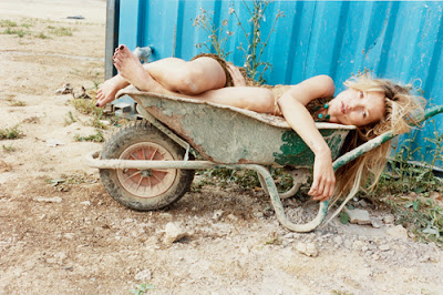
This photograph was taken by Juergen Teller, a famous fashion Photographer from Germany. He was born in 1964 and moved to London in 1986 aged 22 where he started his career. His work has been featured in many magazines such as 'The Face', 'Vogue', 'Another Magazine' and 'Self Service'. This photograph was taken for Self Service magazine in 2010 of Kate Moss at her house in Gloucestershire.

It is a fairly distant view of Kate Moss laying in a wheel barrow. All the colours in the image are natural, earthy colours except from the blue wall that is behind Kate Moss. This bright colour along with the lines on the wall, that add texture, make her stand out more.

Juergen Teller uses two Contax G2 cameras with flashes to capture different aspects of the subject, this means the image is less posed as the model doesn't know where to look. 

I really like this photograph as it has a nice composition and the natural colours along with the bold blue background work well together.

Friday, 8 March 2013

Sigmar Polke Analysis


Sigmar Polke was a German painter and photographer from 13 February 1941- 10 June 2010. He was a self taught artist that experimented with lots of different styles, materials and techniques to create his work. New York Observer said 'Polke used his camera like a sketchbook; and he treated his photos like paintings, experimenting with, altering or deliberately bungling the development process to create unusual visual effects. Most of his prints are creased and stained. Everything seems unfinished—not in the sense of lacking anything, but in the sense of still being in play'. 

The artist has used different textures and patterns within the image to add more depth and meaning to it. For example in the bottom right hand corner there is a dotted print on the background with what seems to silhouettes of people on top of it, this makes the work more exciting and have a better effect.

The photograph has been planned out as it has many different sections and images within the page, the artist must have composed them in a certain way. The artist has used an SLR film camera to take the photographs and then used the darkroom to print them onto the page. He has used multiple exposures and lots of different techniques to build up layers to the image such as combination prints, painting on developer and photograms. 

I really like this piece of photography as it has so much going on it really draws the viewer in as it makes you want to look at all the little details to try and find out what the artwork is about. It is also really interesting as i'd love to know how he made it. The only thing i dislike about it is that some parts seem to be over exposed and some parts seem to have no relevance to each other. However I would like to try out some combination prints and this has inspired me to try making  a photo montage or collage.


Thursday, 7 March 2013

Film experiments

Negative Sandwiching:


Handmade Negatives:


This negative was made using Vaseline.


This negative was made using salt.

For these two images below I used the salt negative along with an image from my film:


Stencils:


Thursday, 14 February 2013

Tuesday, 12 February 2013

Covert and Obscure Moodboard


Initial ideas: Life


I find this idea the most inspiring and it has the biggest range of possible approaches to take.

For secondary research I will be using Pinterest and Behance to look at images relating to my chosen theme and to create mood boards. For primary research I will be taking pictures of possible ideas that I want to use for my outcome.
The artists I will be looking at are Sally Mann, Barbara Hilski and Justin Quinell.

I would like to experiment using black and white film, drawing/cutting into the photographs by hand and using different tutorials in Photoshop.


Saturday, 9 February 2013

Rankin Inspired Photographs

These are my Rankin inspired experiments:


I used black biro pen to scribble out all of the image apart from my eyes.


Here I used a felt tip pen to doodle on my face, I then added some masking tape around the edges of the picture and coloured the picture in with a bit of pink chalk.


I ripped up some newspaper and stuck the pieces around the edges of the picture, I then blocked out my eyes with a piece of masking tape.


For my final experiment I used the sepia effect when taking the image, I then ripped up the picture and stuck the pieces back down on a different page.

Thursday, 7 February 2013

Rankin Analysis

This photograph was taken by Rankin for his project called 'Destroy'. For this project Rankin took many pictures of different artists which he then gave back to them so they could 'destroy' or edit them in a way that portrays there personality. These images were then put into a book and are being sold to raise money for the 'Youth music' charity. 
Rankin is a middle aged photographer who has done work for many different companies such as Nike,  Swatch and Vogue. In 2001 he launched a magazine, 'AnOther', that focused on fashion and originality. He has also published over 30 books and his work has been in many galleries around the world.


This is a photograph of Kylie Minogue taken by Rankin. 

It is a close up of the top half of her body from the side. The picture has been made black and white before the singer has drawn over the top of it in red, using make up possibly nail varnish. She may have used this as it is associated with beauty and its an everyday object that she uses. The arrangement of the picture is pleasing as it is very expressive. Kylie has focused the make up in circles around her chest area, this could be because of her battle against breast cancer that she is trying to express through the picture.
The photograph was most likely planned by Rankin as it was taken in a studio and he probably wanted to portray the subject in a certain way. There is no dramatic lighting effects but the main light is behind the subjects head. The photographer has also edited the brightness/contrast of the image to enhance the colours and made it black and white. 
The photograph captures a good mood as the artist is listening to music through headphones and the abstract doodles over it could express how she was feeling. This also gives it a very violent feel to it.