Saturday, 9 February 2013

Rankin Inspired Photographs

These are my Rankin inspired experiments:


I used black biro pen to scribble out all of the image apart from my eyes.


Here I used a felt tip pen to doodle on my face, I then added some masking tape around the edges of the picture and coloured the picture in with a bit of pink chalk.


I ripped up some newspaper and stuck the pieces around the edges of the picture, I then blocked out my eyes with a piece of masking tape.


For my final experiment I used the sepia effect when taking the image, I then ripped up the picture and stuck the pieces back down on a different page.

Thursday, 7 February 2013

Rankin Analysis

This photograph was taken by Rankin for his project called 'Destroy'. For this project Rankin took many pictures of different artists which he then gave back to them so they could 'destroy' or edit them in a way that portrays there personality. These images were then put into a book and are being sold to raise money for the 'Youth music' charity. 
Rankin is a middle aged photographer who has done work for many different companies such as Nike,  Swatch and Vogue. In 2001 he launched a magazine, 'AnOther', that focused on fashion and originality. He has also published over 30 books and his work has been in many galleries around the world.


This is a photograph of Kylie Minogue taken by Rankin. 

It is a close up of the top half of her body from the side. The picture has been made black and white before the singer has drawn over the top of it in red, using make up possibly nail varnish. She may have used this as it is associated with beauty and its an everyday object that she uses. The arrangement of the picture is pleasing as it is very expressive. Kylie has focused the make up in circles around her chest area, this could be because of her battle against breast cancer that she is trying to express through the picture.
The photograph was most likely planned by Rankin as it was taken in a studio and he probably wanted to portray the subject in a certain way. There is no dramatic lighting effects but the main light is behind the subjects head. The photographer has also edited the brightness/contrast of the image to enhance the colours and made it black and white. 
The photograph captures a good mood as the artist is listening to music through headphones and the abstract doodles over it could express how she was feeling. This also gives it a very violent feel to it.

Wednesday, 30 January 2013

Evaluation


This project was the 'Light Project', for this brief we had to explore different uses of light within photography such as light painting, studio lights to create different moods and shadows, night-time scenes, natural lighting such as sunset/sunrise etc. After exploring these techniques we had to chose a path we wanted to follow, I decided to choose portraits. We then had to develop our ideas down this route and come up with a final piece that related to this and the light theme.

At the beginning of the project we created a mindmap to explore all the different possibilities the project could lead to and a mood board of different photographs that inspire us. Next we experimented taking still life and portrait photographs with SLR cameras, using laser pens and iPads to create light painting effects with digital cameras and digital portrait photographs. From this experimentation I decided that I wanted to choose portrait photography for my final outcome as I enjoyed this the most. I played around with some of my portrait photographs layering them up in Photoshop to get a multiple exposure effect. Next I took a couple of friends out on a photo shoot to a local woods to take some photographs in natural daylight. After taking these photographs my first idea was to add a surreal effect to them to make them more interesting. I then looked at Lin Osborne's work and decided that I wanted to create something similar to it as I didn't want to play around with the pictures too much. From this I came up with the idea of having a series of circular pictures in black and white.

 Lin Osborne was my main inspiration for my work as I really loved her work and it was unique compared to all the other photographs I had looked at. Here is an example of her work:


I think my final pieces work well as they have a big impact when looking at them all together and they give an abstract effect from a distance. Especially the neon signs outcome as the colours are very bright.

In my final outcomes I think I could have improved the black and white circles as the gradient of dark to light pictures could have been stronger and some of the photographs are a bit out of focus.

I really enjoyed this project as it allowed for such a broad range of experimentation and I learnt a lot more techniques. One of my favourite experiments was the light painting with the iPads and laser pens and I would like to develop this in the future. 

Friday, 18 January 2013

Lin Osborn Analysis

This piece of work is by Lin Osborn, a contemporary photographer, she graduated in 2001 with a BA Hons in Fine art. The name of the artwork is 'Rainbow' as the photographs are put in to different rows depending on there colour, to make up the rainbow. I have chosen to analyse this piece as I would like to do something similar for my own work, using lots of different circle images to make an abstract piece. 
I have looked at the photographers website to further my understanding of the work, I found that she likes to use series of small detailed images that relate to each other. Such as lots of blue objects, different doors, flowers or things that relate to London to make up her original styled artwork. 
She has cropped the original images to get close ups of the coloured objects. This makes the colours stand out better as there is no background colour to cause distraction from the object. The size of the artwork is 40x50cm, from a far this will make the work look abstract as the detail will be less visible from a far and only the colours will be prominent. 
I really like this piece of artwork as it is unusual and the effect of it changes depending on what angle/distance you look at it from. From a far it looks like one big picture but when you look up close you can see the detail of each individual image. 

Here are some more examples of her work:


Wednesday, 16 January 2013

Maia Flore Analysis


Maia Flore is a French artist born in 1988. She works for Agence VU and her work is inspired by the boundaries she sees of reality. This photograph above is part of her 'Sleep elevations' series. The theme of the piece is surrealism. I chose to analyse this piece as I would possibly like to add a surreal effect to some of my portrait photographs.
The picture has been taken from a distant view of the subject to capture some of the surroundings as well. The subject of the picture is a sleeping girl, that is floating in the air. It has been made using different layers in Photoshop, the image of the girl sleeping has most likely been cut out and placed onto this background. The artist has used feminine colours to add to the dream effect it is giving.
I like this photograph as it looks so simple and elegant. I also think it is very effective as it looks so real and the composition of the piece looks really nice.

These are some more examples of her work:


Monday, 14 January 2013

Final Outcome Idea


From this image I have decided that i want to push the idea further by adding more circle images and create a scale of the shades by having darker images one side and brighter images the other side. To do this i would change the position of the cropped circle in the original image of each so either more of the landscape is being shown to get the lighter effect or to zoom in on the person face for the darker images. From a far this would create a bold abstract effect when looking at the images.

Saturday, 12 January 2013

Photoshop Lighting effects

To create these images I used different lighting effects in Photoshop such as different lens flares. To create the circles I made a new layer filled it with black and cut out a circle from the centre. I then changed the opacity of the new layer so that the image below would show through.


Blue omni:

105mm Prime:


Flash light:


105mm Prime:


To develop these I would like to cut out the circles from the image instead so that all the attention is focused on the person in the image. My favourite from these experiments is the black and white photograph.

Photoshoot

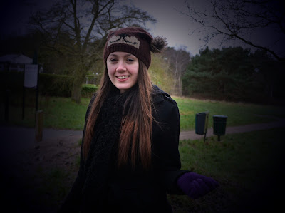
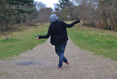
These photographs were taken with a Nikon D3100 at Shirley Hills.


Aperture: F5 Speed: 1/100 Lens: 26 mm ISO: 400


Aperture: F5.6 Speed: 1/125 Lens: 35 mm ISO: 140


Aperture: F5.3 Speed: 1/25 Lens: 45 mm ISO: 400


Aperture: F5.6 Speed: 1/20 Lens: 55 mm ISO: 400


Aperture: F4 Speed: 1/500 Lens: 22 mm ISO: 2800


Aperture: F5 Speed: 1/250 Lens: 36 mm ISO: 3200


Aperture: F5.6 Speed: 1/125 Lens: 40 mm ISO: 250


Aperture: F5.6 Speed: 1/125 Lens: 55 mm ISO: 200


Aperture: F5.6 Speed: 1/125 Lens: 55 mm ISO: 220


Aperture: F5.6 Speed: 1/125 Lens: 44 mm ISO: 160


Aperture: F5.3 Speed: 1/125 Lens: 40 ISO: 400


Aperture: F5.6 Speed: 1/125 Lens: 44 mm  ISO: 140


Aperture: F5 Speed: 1/100 Lens: 34 mm ISO: 400


Aperture: F5.3 Speed: 1/15 Lens: 44 mm ISO: 400


Aperture: F4 Speed: 1/60 Lens: 18 mm  ISO: 400


Aperture: F5 Speed: 1/100 Lens: 18 mm ISO: 400


Aperture: F4.8 Speed: 1/60  Lens: 32 mm ISO: 400


Aperture: F4.5 Speed: 1/80 Lens: 28 mm ISO: 400


Aperture: F5.6 Speed: 1/125  Lens: 50 mm ISO: 360

Friday, 11 January 2013

Double exposure


To make this images I used the photograph of Central park and placed the photograph of the black cat over the top. I used the layer blending mode 'Screen' so that the background photograph would show through, giving this effect. 

Thursday, 10 January 2013

Landscapes

Photographs taken with a Nikon D3100 in New York.


Aperture: F5.6 Speed: 1/125 Lens: 29 mm ISO: 100
Taken from the top of the Rockafella building of New York skyline.


Aperture: F5.6 Speed: 1/125 Lens: 24 mm ISO: 180
Taken in Central park.


Aperture: F5.6 Speed: 1/125 Lens: 52 mm ISO: 180 
Taken from Central park.


Aperture: F7.1 Speed: 1/200 Lens: 18 mm ISO: 100
Taken from Brooklyn bridge of the skyline.

Moodboard


Tuesday, 8 January 2013

Portrait Experiments


To make this picture I used a photograph from my portrait photo shoot that I have cropped and made black and white. I then cut out one of the cats heads from the animal photographs and placed it over the top, using the smudge tool to roughen up the edges so it looks more realistic. To improve this I need to get rid of the black background left around the top of the cat head and also get rid of the shadow in the background as it shows the shadow of the person that was previously there.